So you like the new uniforms for your Tampa Bay (Sting)Rays? I value your opinion, fair-minded observer. Allow us to discuss.
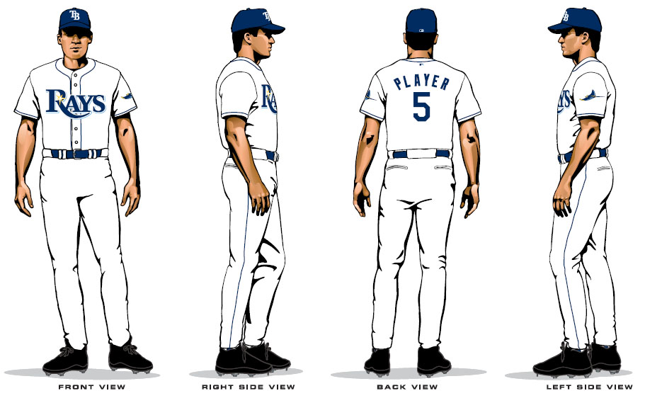
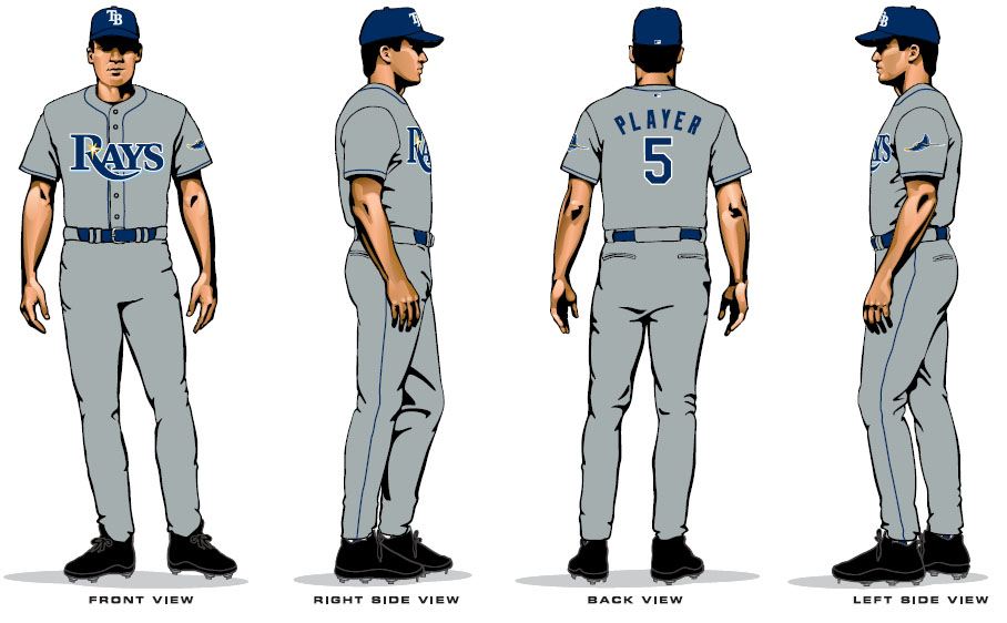
What is your favorite part? Is it how we went from one of baseball's unique color schemes to the color navy blue, which 15 other teams have? Is it how you now can barely tell the difference between us, the Mariners, or the Padres from a distance? Did you like the font, which is essentially Times New Roman, and looks like someone actually typed it on the fucking jersey, only using the "R" from Ryan's Steak House, and in letters that are waaaaaaaaaay too big?
Did you like the cute little sunbeam they threw in there? Yes there is still a stigray on the sleeve, but the Rays themsleves seemed confused at what they are trying to be (it should be the stingray). Do you like the "logo", which is not really a logo so much as the word "Rays" in its pathetically generic typefont with an even more generic baseball diamond in the background? At least no other teams have thought of that.
There's a difference between simple and boring. The Detroit Tigers have simple uniforms, and they are gorgeous. The Yankees, Cubs, Red Sox, Braves, and countless other teams from other sports like the Packers or Chicago Blackhawks have simple uniforms that are classically elegant, nice to look at, and stand the test of time because they're built to last. The (Sting)Rays uniforms may not end up being hideous, but one other thing they won't be is a trademark, because they'll look like about 15 other teams.
And last but not least, did you like how both the home and road uniforms are the same? Do know what difference all those other aforementioned baseball teams have between their home and road uni's? THE NAME OF THEIR FUCKING CITY ON THE ROAD UNIFORMS. The (Sting)Rays apparently didn't see fit for the area to be represented on the road. They thought it was more important to keep pushing the most bland, insipid, and uninspiring nickname in all of professional sports on us for 162 games a year, essentially trying to disconnect the franchise from its home location with the demented notion that the words "Tampa Bay" on the uniform might discourage the extra 15 people they are trying to attract from Orlando and Sarasota and wherever the hell else they think people actually care. Your fans are in TAMPA BAY, and they will support this team if given a reason to get excited. The 99% of those fans that are actually here in the Tampa Bay area and identify with that local pride? Well, fuck 'em, according to the (Sting)Rays.
These uniforms are a colossal airball on the part of the franchise in every possible way. The words "transcendant embarrassment" keep coming to mind, and it's not the first time for a franchise that has developed a reputation as a national joke, mainly because the people in charge are capable of doing things like spending two years and hundreds of thousands of dollars in order to come up with something that could've been thrown together in about 15 minutes, but would take only about another 10 minutes to be bettered. Stop and think about that for a second. It took them two years and hundreds of thousands of dollars, and at the end of it all, they produced this and this.
I am so pissed off right now, and yet the most frustrating part is that I knew, KNEW, they would fuck this up, and then I was only still to be shocked that even my own low expectations were submarined to depths even I found surprising.
So you liked the new uniforms? I was just checking.